
eBay Kleinanzeigen
Login/Register redesign
Overview
eBay Kleinanzeigen is the biggest free online marketplace for classified ads in Germany and it has an average of over 33 million ads listed at any given time.
With its roughly 30 million users a month, eBay Kleinanzeigen has one of the greatest ranges of any web service in Germany.
Role
Research, UX, UI
Platforms
Android, iOS

Challenge:
To improve the existing login and registration flow of the mobile app, having in mind the massive traffic that the new solution should handle, highlighting the unique USPs of having an account with eBay Kleinanzeigen, uplifting the design and modernising it.
Initial state (where we started)

Step 1: Goals
What do we actually want to achieve?
Less drop in Registration -> Activation flow
Clear communication and explaining the value of having an account
Increasing the number of registered users
Learn more about the user behaviour before and after the registration
Increasing brand love
Keeping the users in the platform for long term
From the brainstorming

Step 2: The problem
When using the app for the first time users needs first to create an account and to register
Pages are HTML based and not native to the platform
Generic design, no brand identity
96% of users stays logged in (Only 4% needs to see the login screen first)
No redirection to register screen after failed login
Broken flow and consistency
No clear benefits
Must activate account in email client
Step 3: Competitors analysis
Shpock
Whole flow is in an overlay screen
Different flows to register and login
Social Login / Register
SMS validation of account
Help Center on Main login screen
Brand love
Account customisation (Profile photo)
Additional offers after registration

Kleiderkreisel
Forced registration upon first use
Skip registration
Social Login / Register
Different flows to register and login
Brand love
Identify Pre-registered user on registration flow
SMS validation of account

Wayfair
Onboarding /USP’s as part of Register / Login flows
No need to choose a path - Identify login / register automatically
Brand love
Forced registration upon app start (Can exit)
No need to validate account
Suggestion to activate notification right after registration

Step 4: Suggestions
Based on user interviews and best industry practices
Brand love on first screen (Logo / tagline)
Combining the registration and login flows
Adding Social / eBay login paths
More than one way to activate account e.g. via SMS (Is activation really mandatory?)
Highlighting USP before / during creating an account
Adding an Help center
Creating the flow as an “overlay” screen that allows the user to close screen and go back to previous screen
Displaying action related information upon request to register

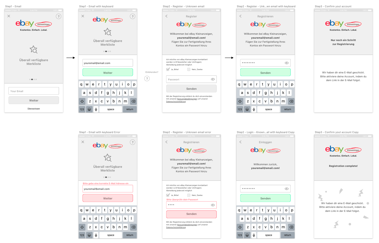
Step 5: Flow & wireframes
One native entry point
Creating a consist flow that both Android and iOS shares
Easy path selection between registration and login flows
Highlighting the values of creating an account
Success screen with clear instructions regarding the next step (activation of account)

After the first wireframes were created, several rounds of tests were made in house and with users to validate how usable the new flow is.
Step 6: Validate with users
We have invited users for our office and presented them the new suggested flows and a set of tasks to be preformed.
What we tried to learn at this point were few things:
Are the CTA simple and clear enough?
Should we focus on login or registration?
Ask for information progressively (like you get to know a person) and communicate value of it
Does users want the possibility to see the password?
Have we created clear error messages (also for password requirements)
We viewed their behaviour while a group of dedicated watchers took notes, and after the interviews we clustered all of the outcome and created a set of tasks for us to iterate on after finding few issues with the flow.

Step 7: Design
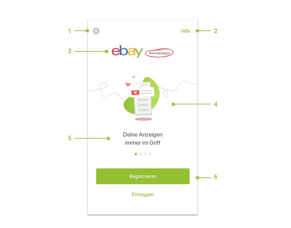
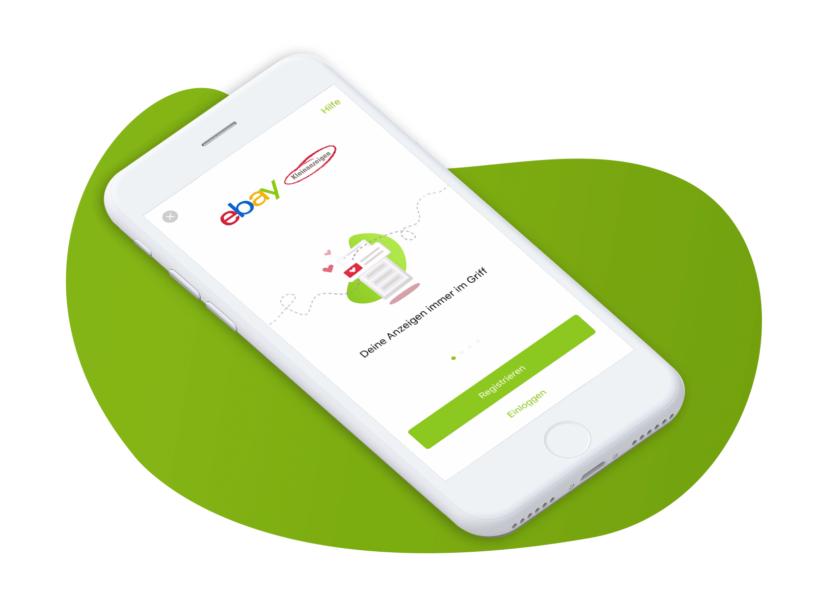
Entry screen
Entire screen opens as an overlay and by that does not interrupt with the user journey
Access to help page
Adding the logo for brand recognition
Adding illustrations to visually connect between the values
Highlighting the 4 main USPs of the platform with a simple swipe
Clear preference for users to register with a clean UI with secondary CTA to login
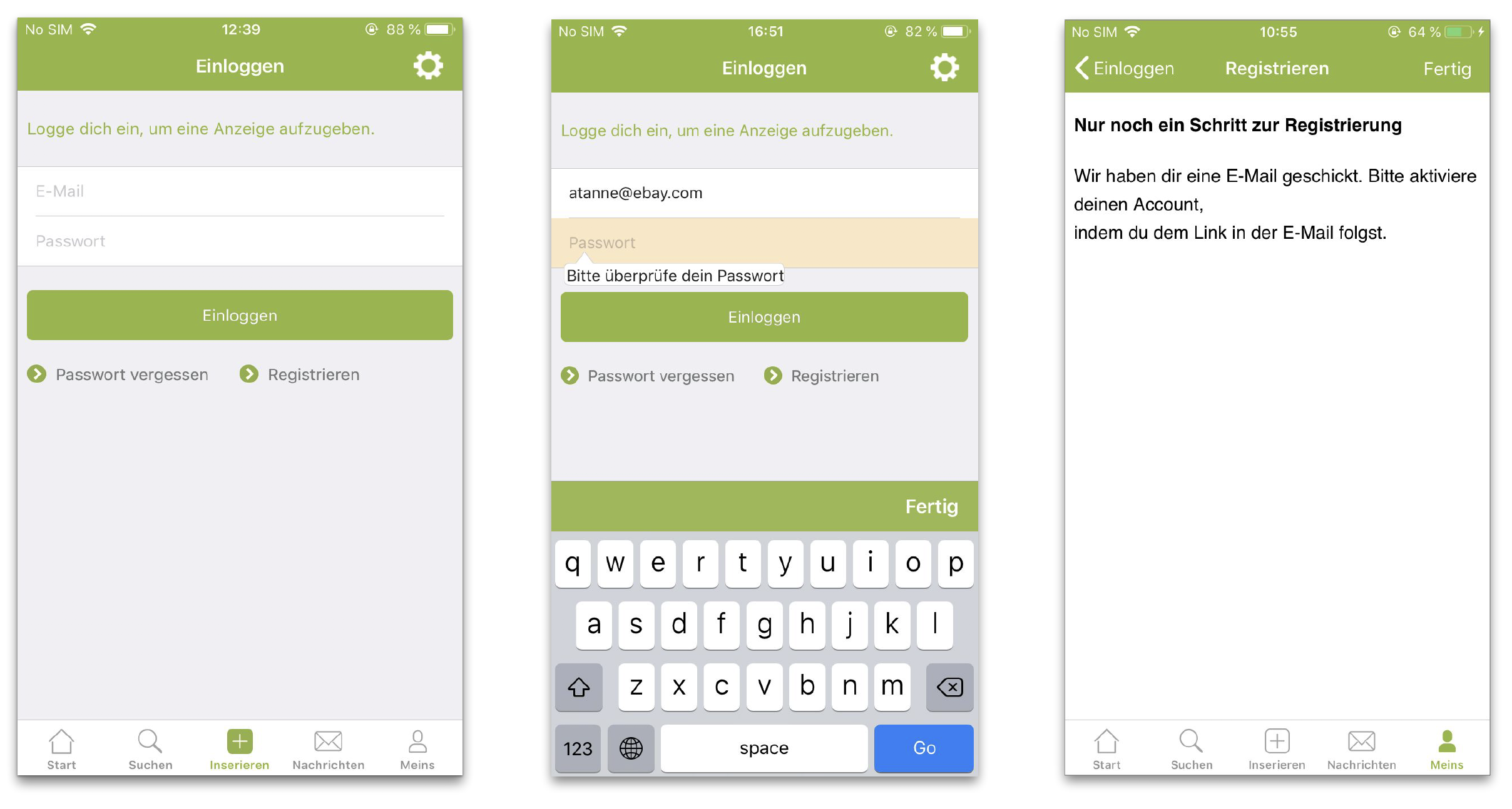
Login & Register screens
Back to main screen
Email field
Password field
Switching to other paths
Agreeing to the terms of conditions
Execute the request the Login / Register

Activate account screen

At the end of the registration process, the user is asked to activate his account by clicking a link in the email that was sent to his email account during the registration process.
We managed to reduce the rate of users that do not activate their account after registering by making it visually clear that an email was sent to them and we also removed all exit point from the flow, so that the user will be forced to leave the app and activate the account via the mail in order to continue with his journey in eBay Kleinanzeigen.

Thank you, Next —


